Designing a Scalable Website & Visual System for Medical Imaging
Redesigning the Pacific Northwest X Ray website to improve usability, clarity, and credibility for professional buyers navigating complex product flows.

Overview
This project redesigns the Pacific Northwest X Ray website, a B2B supplier of medical imaging equipment. The existing website contained dense product information and non standard ordering processes, making it difficult for professional buyers to quickly locate relevant products and understand how to place orders. The redesign focused on improving information clarity, navigation structure, and visual consistency to support efficient product discovery and decision making.
Project Context
The website serves medical imaging professionals who purchase specialized equipment such as X ray systems, imaging accessories, and technical components. These users often need to quickly locate specific products, review technical specifications, and determine the appropriate ordering method.
However, the original website presented several challenges including unclear navigation structure, inconsistent visual hierarchy, and fragmented ordering information. These issues increased cognitive load and made product discovery slower for professional users.
Before & After
1. Navigation Clarity
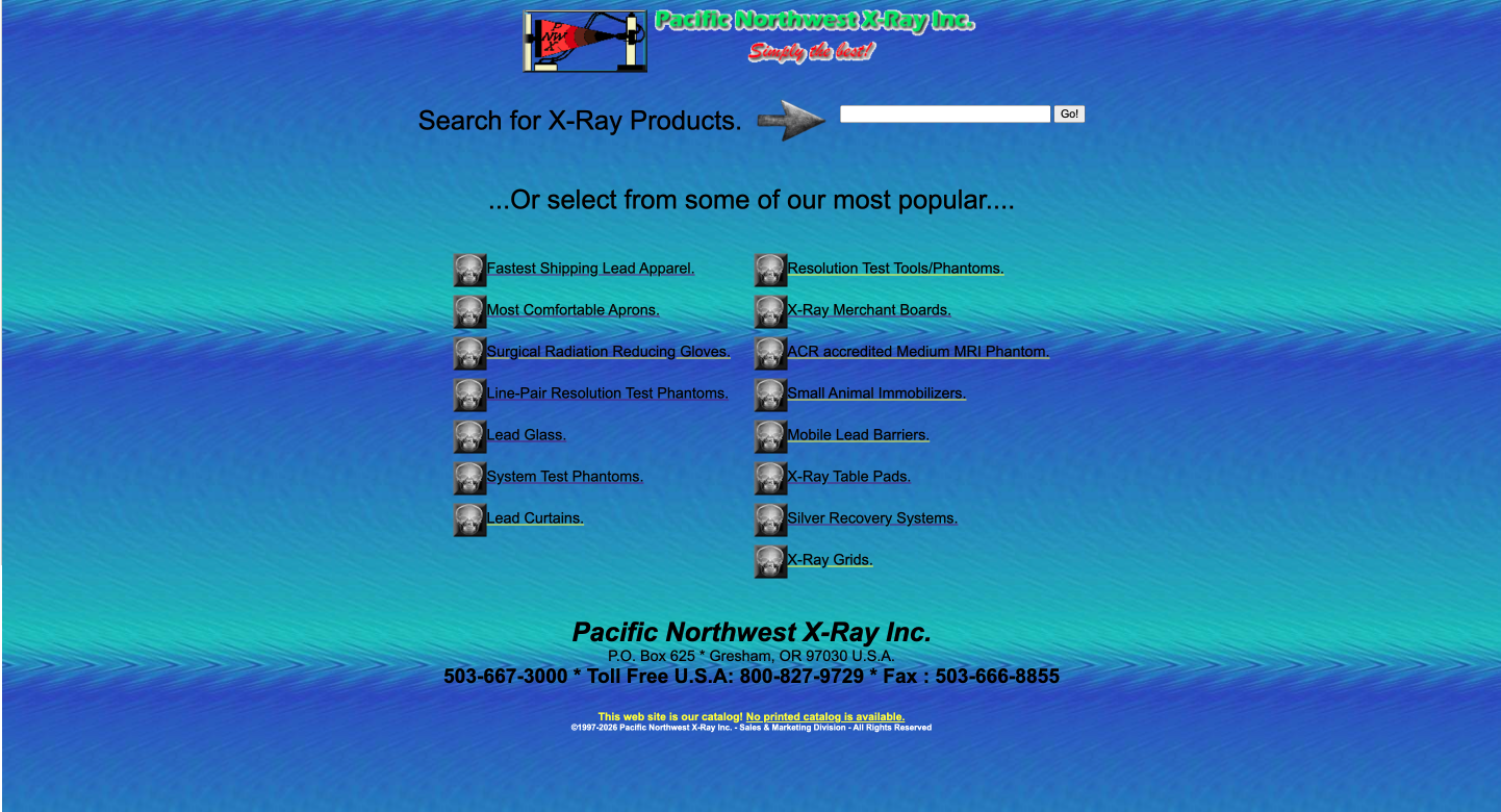
Before
The original homepage relied heavily on long lists of text links to represent product options. Categories were not clearly grouped, and navigation elements were visually scattered across the page. As a result, users had to read through multiple links to understand where different products were located.
For a product-heavy B2B catalog, this structure increases cognitive load and makes it difficult for professional users to quickly locate relevant equipment.
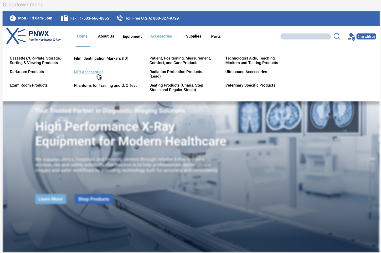
After
The redesigned navigation introduces a structured menu system with clearly grouped product categories such as equipment, accessories, supplies, and parts. A consistent navigation bar and dropdown structure help users quickly scan available sections and understand how products are organized within the site.
This improves orientation and allows users to move between product categories more efficiently when searching for specific equipment.
2. Information Hierarchy & Product Discovery
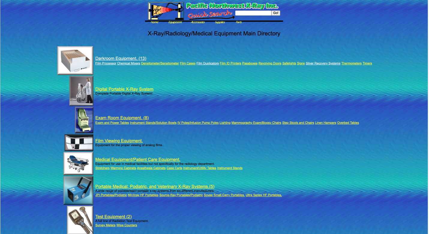
Before
The original product directory presented dense information with minimal visual hierarchy. Category titles, product links, and supporting descriptions shared similar visual weight, making it difficult for users to distinguish primary navigation paths from secondary content.
In addition, product browsing relied heavily on long lists of text links. Users needed to read through multiple lines to locate relevant equipment or subcategories, which slowed down scanning and made product discovery less efficient.
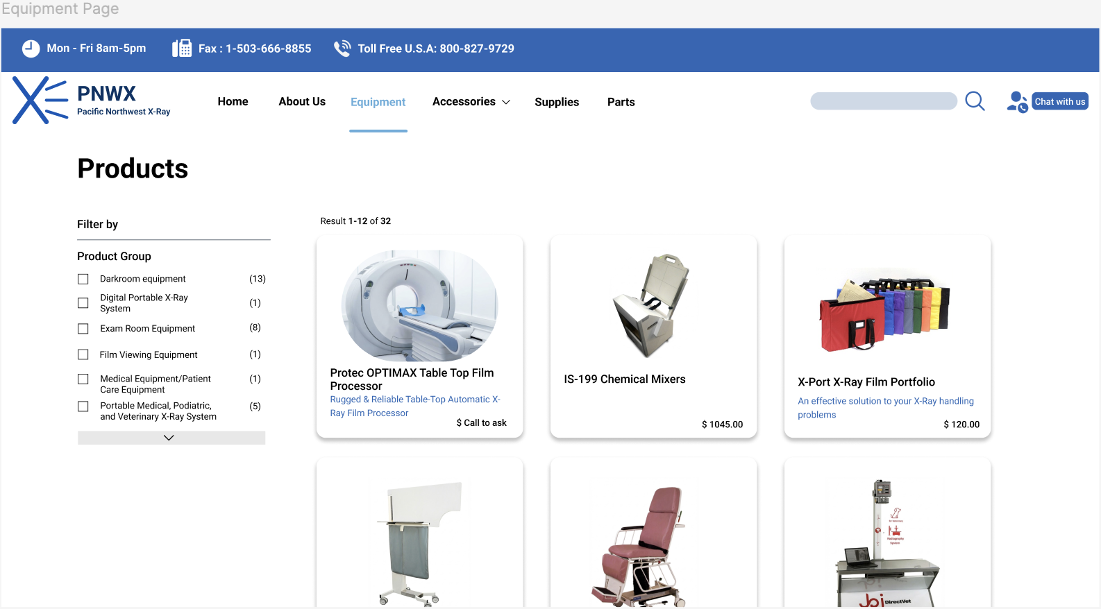
After
The redesigned interface introduces a clearer typographic and structural hierarchy to organize product categories and listings. Larger headings, consistent spacing, and grouped content blocks help separate primary categories from detailed product links.
Product listings are also presented in a more visual layout, allowing users to quickly scan available options and identify relevant equipment without reading through long text lists. This improves both scannability and efficiency when navigating a product-heavy catalog.
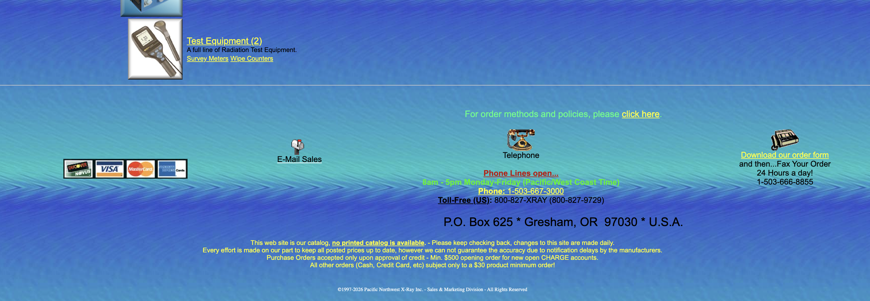
3. Ordering & Contact Accessibility
Before
In the original website, information about how to contact the company or place an order was located at the bottom of the page and presented as dense text. Important details such as phone numbers, email contact, and ordering instructions were embedded within paragraphs, making them easy to overlook.
For users who have already identified a product, locating the next step in the purchasing process required unnecessary scrolling and reading.
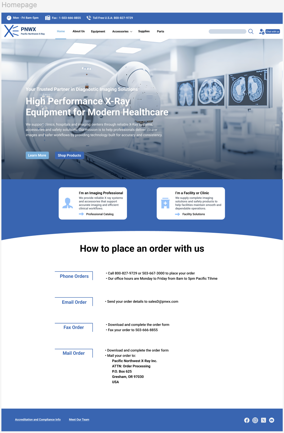
After
The redesigned interface introduces a dedicated section that clearly explains how users can place an order. Ordering methods such as phone, email, fax, and mail are organized into structured options with clear headings and concise instructions.
By making these actions visible and easy to scan, the redesign reduces friction and helps users quickly understand how to proceed once they have selected a product.
User Research & Analysis
To understand usability challenges in the existing website, I reviewed the interface through the lens of the core user task: locating medical imaging equipment and contacting the supplier to place an order.
The analysis revealed several key issues:
-
Text-heavy product discovery
Product categories and items were presented as long lists of links, requiring users to read through multiple lines to locate relevant equipment. This slows down scanning in a product-heavy catalog.
-
Limited navigation feedback
The navigation structure provided little indication of where users were within the site, making it harder to maintain orientation while browsing different product sections.
-
Hidden ordering and contact actions
Contact details and ordering instructions were buried near the bottom of the page, making the next step in the purchasing process easy to overlook.
A brief review of comparable B2B equipment websites also showed consistent UX patterns such as structured category navigation, visually grouped product listings, and clearly accessible contact options.
These observations informed the design improvements presented in the redesign.
Key Insights
The analysis of the existing interface revealed several key insights that guided the redesign.
-
Product-heavy catalogs require strong visual hierarchy
When product information is presented as long text lists, users must read through multiple lines to locate relevant items. Clear hierarchy and visual grouping help users scan categories more efficiently.
-
Users should recognize product categories rather than recall them
Structured navigation and visual grouping allow users to quickly recognize product categories instead of remembering product names or reading through dense lists of links.
-
Key actions should be immediately visible
Once users identify a relevant product, the next step is contacting the supplier or placing an order. Making ordering and contact options clearly visible reduces friction in the purchasing process.
Design Principles
The redesign was guided by several design principles derived from the research insights.
-
Prioritize clear information hierarchy
Product-heavy catalogs require strong hierarchy to support quick scanning. The redesign emphasizes structured layouts, clear headings, and grouped content to make product categories and information easier to navigate.
-
Support recognition through structured navigation
Instead of relying on long lists of links, the interface introduces clearer category grouping and consistent navigation patterns. This allows users to recognize product sections quickly without reading through dense text lists.
-
Make key actions visible and accessible
For users who have already identified relevant equipment, the next step should be immediately clear. The redesign highlights ordering and contact options to reduce friction in the purchasing process.
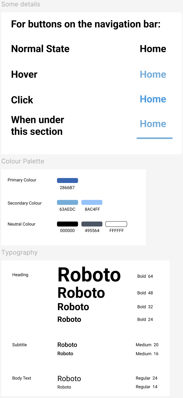
Visual System
To support clarity and consistency across the website, a visual system was developed to organize information and improve readability within product-heavy pages.
Key elements include:
-
Color system
A blue-based palette communicates reliability and aligns with common visual conventions used in medical and technical industries.
-
Typography
Roboto was selected for its readability and clean structure, helping establish clear hierarchy across headings, product information, and supporting text.
-
Consistent UI components
Buttons, navigation elements, and product cards follow consistent visual patterns to create a predictable interface across pages.
The visual system reinforces information hierarchy and supports efficient scanning when navigating dense product content.
Results
The redesign turns a dense supplier website into a clearer B2B browsing experience. With stronger hierarchy, more structured navigation, and visible ordering paths, the concept better supports professional buyers as they move from product discovery to action.
Clearer product wayfinding
Grouped categories and more predictable navigation patterns make product sections easier to recognize and revisit.
Faster scanning on dense pages
Stronger typographic hierarchy and visual grouping reduce the effort required to parse long product lists and supporting details.
More visible next steps
Ordering and contact options are surfaced more clearly, helping users understand how to proceed once they identify the right equipment.
Other Projects
Personalized Nutrition
Designing a tailored tracking experience through data visualization.

Health Monitoring
Designing a data-driven health monitoring experience.