Designing a Personalized Food Tracking Experience Through Data Visualization
A mobile concept that helps users understand daily nutrition through clear visuals and intuitive tracking.
Overview
Food Tracker App is a mobile application concept designed to help users better understand and manage their daily nutrition through clear data visualization and intuitive user flows. The project focuses on improving usability, engagement, and readability in food tracking experiences by simplifying complex nutritional data into accessible and meaningful insights.
Designed in Figma, the app combines a personalized onboarding flow with an interactive dashboard that supports daily tracking, progress monitoring, and habit building.
Research & Problem Framing
I began by reviewing existing food tracking and health apps to understand the common usability challenges they present. Many platforms rely heavily on dense data tables and technical terminology, which can overwhelm users and reduce long-term engagement.
UX Direction
Based on these insights, I defined a UX direction centered on clarity, personalization, and emotional ease. The experience prioritizes quick comprehension and positive reinforcement, allowing users to understand their daily intake at a glance without feeling pressured or overloaded.
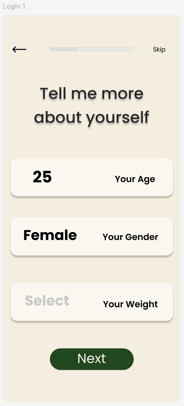
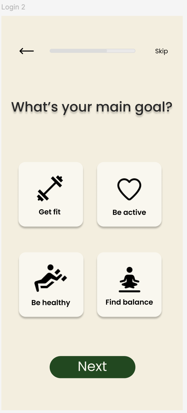
The onboarding flow was designed to gather key user information and goals early, enabling a more tailored experience from the first interaction.
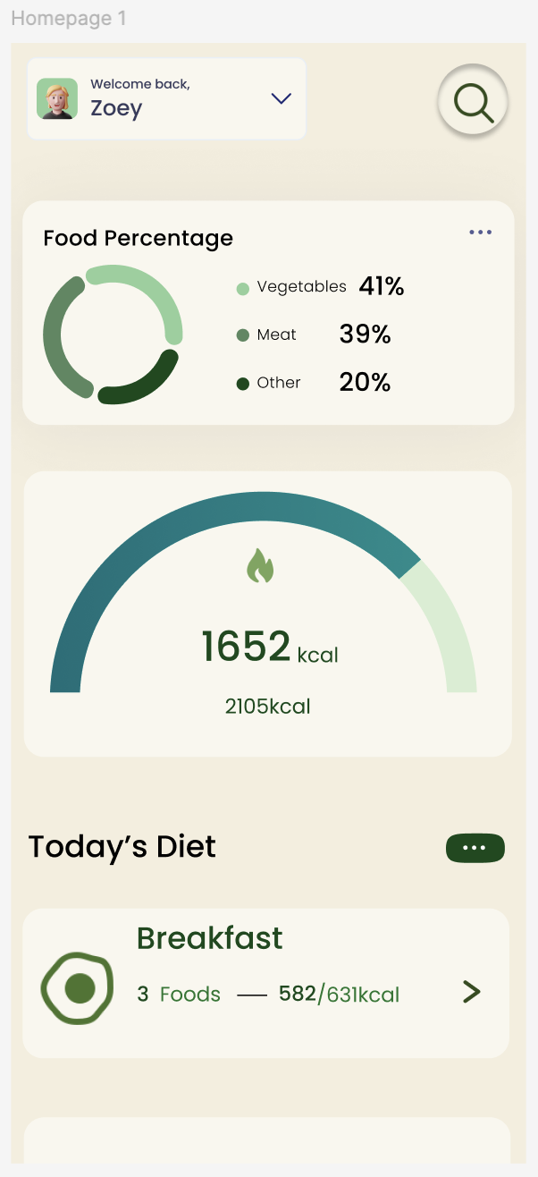
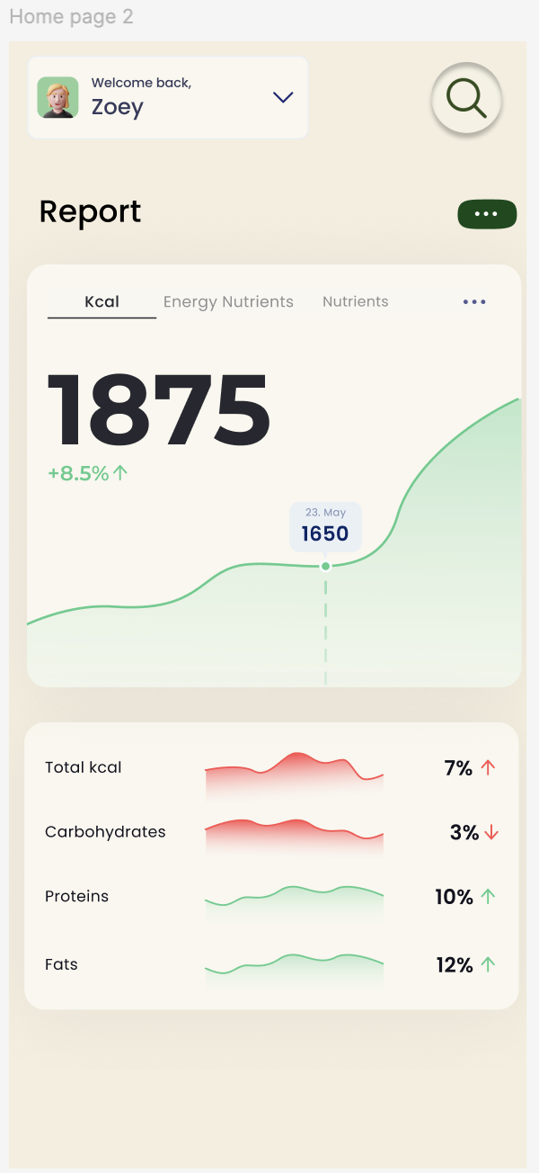
Interface & Data Visualization
The core dashboard presents nutritional data through progress indicators, charts, and simplified metrics. These visual elements help users quickly assess their status and understand trends over time.
A calm, minimal visual language was applied to reduce cognitive load and support longer usage sessions. Consistent spacing, typography, and component patterns were used across screens to maintain clarity and coherence.
Other Projects

Pacific Northwest X Ray
Designing a scalable website & visual system for medical imaging.

Health Monitoring
Designing a data-driven health monitoring experience.