Designing a Data-Driven Health Monitoring Experience
A mobile concept that makes daily heart-rate insights clear, calm, and easy to read.

Overview
Heart Rate Analysis App is a mobile app concept focused on making daily health data easier to understand and less overwhelming. The project explores how heart rate, activity, and wellness information can be presented in a clear and friendly way, helping users quickly understand their status without needing to interpret complex metrics.
The design was created entirely in Figma, with an emphasis on layout, visual hierarchy, and data visualization.
Research & Early Exploration
I began by reviewing existing heart rate and fitness tracking apps to understand common ways health data is presented. Many apps present information through dense charts and numbers, which can be overwhelming or confusing for non-professional users.
Defining the User Experience
Based on these observations, I focused on designing a calming and supportive experience. The interface no longer prioritizes accuracy and performance metrics, but rather emphasizes trends, progress, and overall balance.
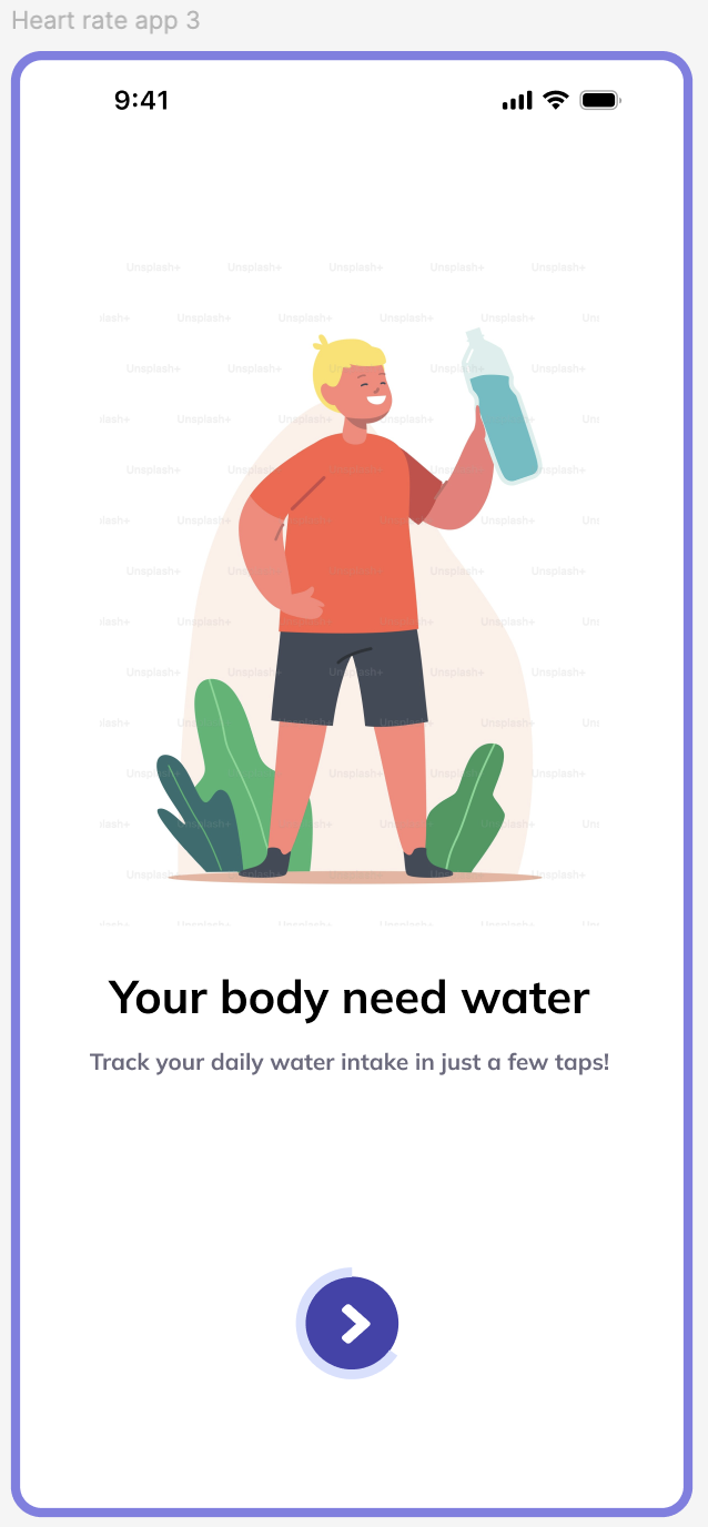
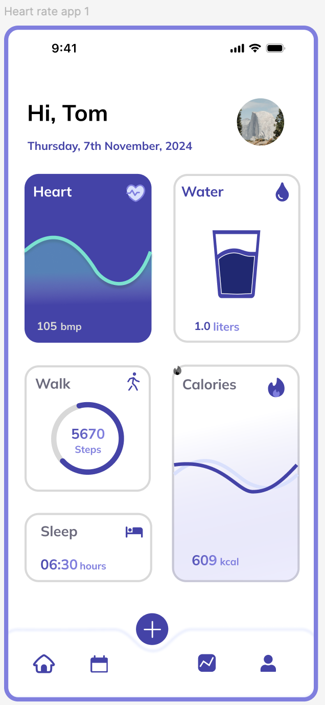
The main dashboard is designed to prioritize the most relevant information, allowing users to quickly view heart rate, calories, hydration, and activity levels.
Interface & Data Visualization
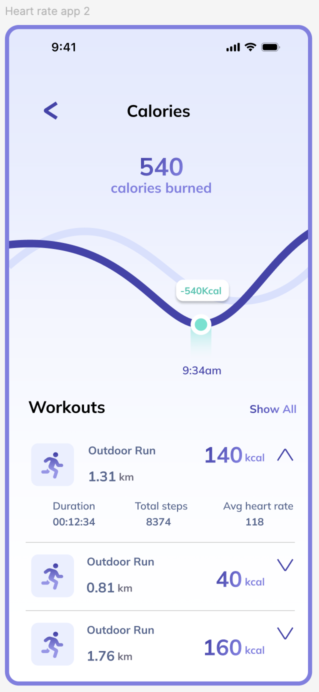
I used clean charts, progress indicators, and a card-based layout to present health data in a more easily understandable way. I considered spacing, alignment, and color usage to reduce cognitive load and improve readability.
Other Projects
Personalized Nutrition
Designing a tailored tracking experience through data visualization.

Pacific Northwest X Ray
Designing a scalable website & visual system for medical imaging.