Visualizing Workforce Diversity and Inclusion Metrics with Power BI
A people analytics dashboard that clarifies representation, movement, and performance.

Overview
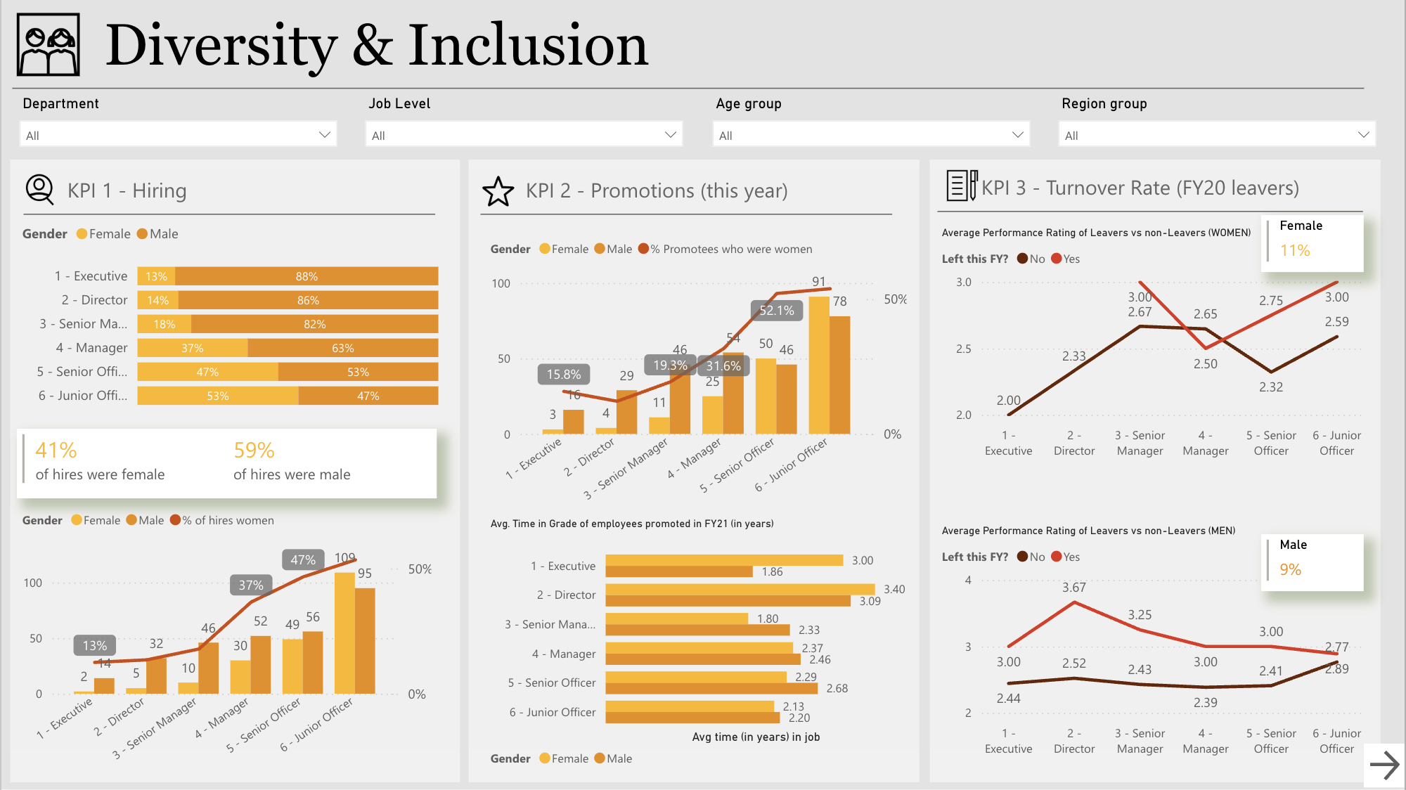
This project is a Power BI dashboard designed to visualize diversity and inclusion data across hiring, promotion, turnover, performance, and leadership representation. The dashboard supports HR teams and executive leadership in monitoring workforce composition, identifying potential inequities, and tracking inclusion-related trends over time. The design focuses on presenting complex people data in a clear, comparable format to support data-informed decision-making.
Key Analysis Areas
Hiring & Promotion: visual breakdown of gender distribution across job levels and promotion outcomes, highlighting gaps in career progression and representation.
Turnover & Retention: comparison of turnover rates and performance ratings by gender and job level to surface potential patterns in employee retention.
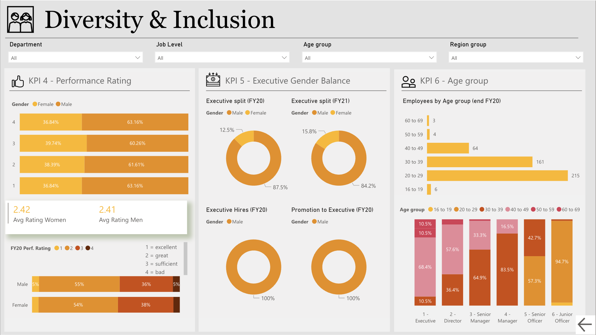
Executive Representation: gender split analysis at the executive level across multiple fiscal years, providing visibility into leadership diversity trends.
Performance Ratings: distribution and average performance ratings by gender, offering insight into internal evaluation patterns.
Age Group Demographics: cross-sectional views of employee age groups across roles and levels, supporting inclusion analysis beyond gender alone.
Other Projects
Customer Risk Analysis
Analyzing churn patterns and risk factors with Power BI.

Performance Analytics
Visualizing call center metrics through Power BI.