Visualizing Call Center Metrics Through an Interactive Power BI Dashboard
A data-driven dashboard that makes operational performance easy to scan and compare.

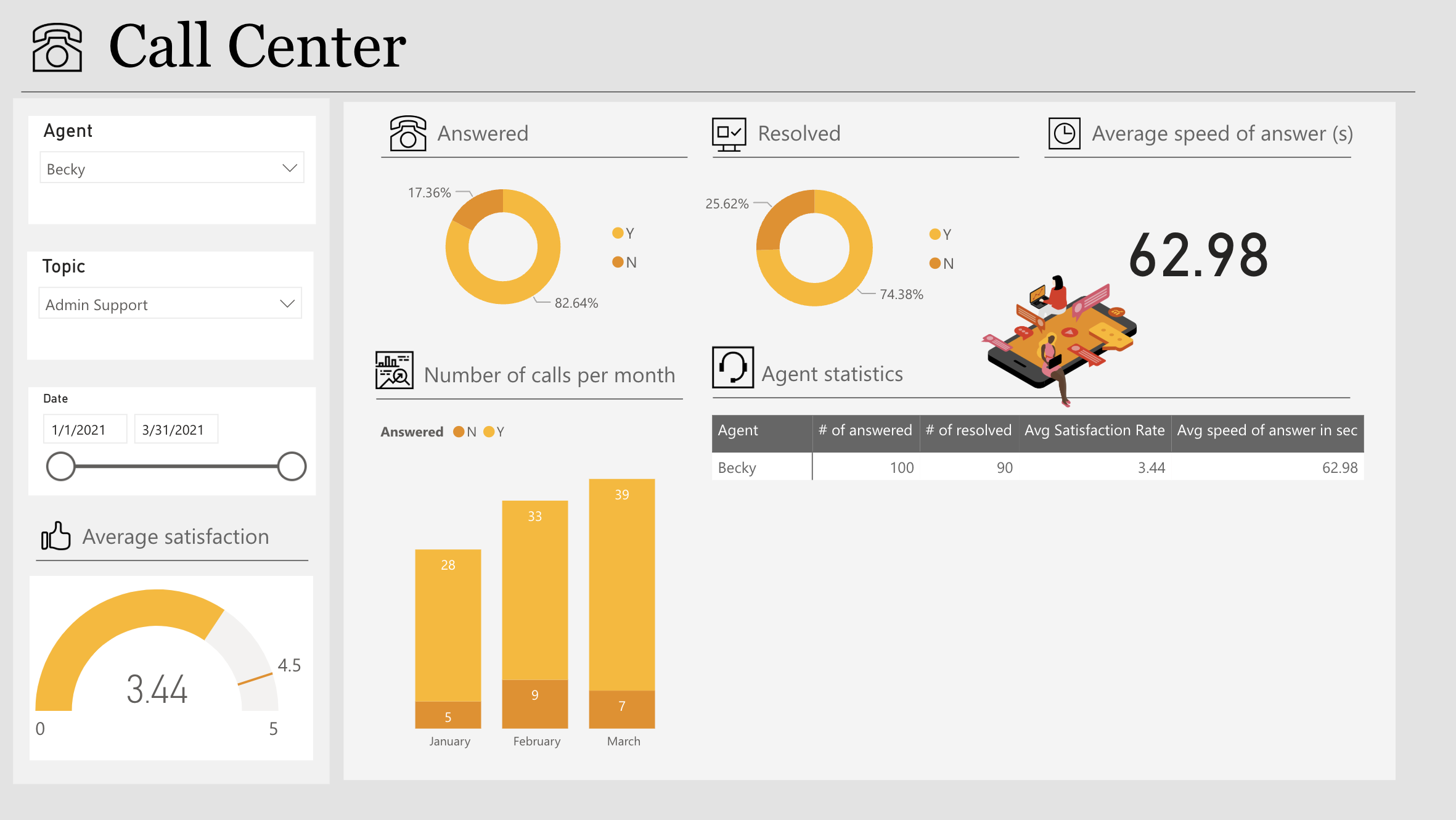
Overview
This project is an interactive dashboard built in Power BI to analyze and visualize call center performance data over a three-month period (January–March 2021). The dashboard focuses on presenting key operational metrics in a clear and accessible way, supporting quick performance review and comparison.
Key Metrics Visualized
Answered vs. unanswered calls. Resolved cases. Average speed of answer. Monthly call volume. Customer satisfaction rate.
Dashboard Features
Interactive slicers for agent, topic, and date range filtering. KPI cards for high-level performance tracking. Pie charts and bar charts for distribution and trend comparison. A dedicated agent statistics table summarizing key performance indicators.
Other Projects

Customer Risk Analysis
Analyzing churn patterns and risk factors with Power BI.

Workforce Analytics
Visualizing hiring, promotion, and representation trends.